T-HUB Brand Visual identity
T-HUB, based in Yemen, is committed to adding value through transparent governance, customer satisfaction, and social responsibility. With over 10 years of experience, it provides innovative solutions across industries like manufacturing, telecommunications, and oil & gas. Specializing in the import/export of electrical materials, machinery, and generators, T-HUB aims to expand into the Middle East, North Africa, and Turkey markets.
CONCEPT

Letter T

HUB monogram

Old logo
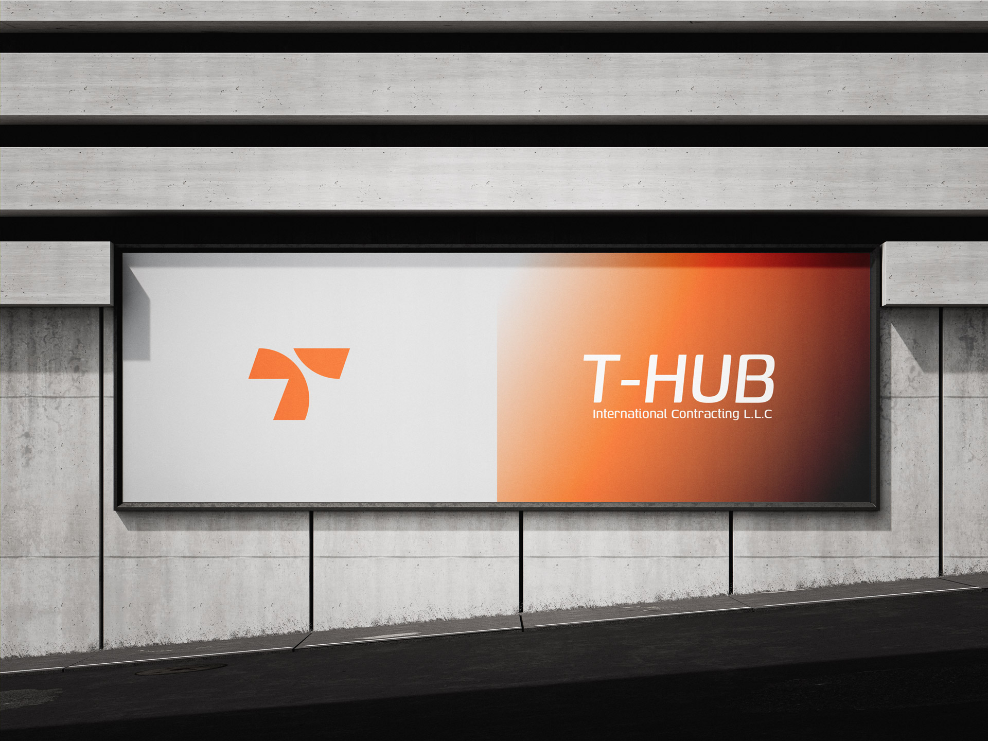
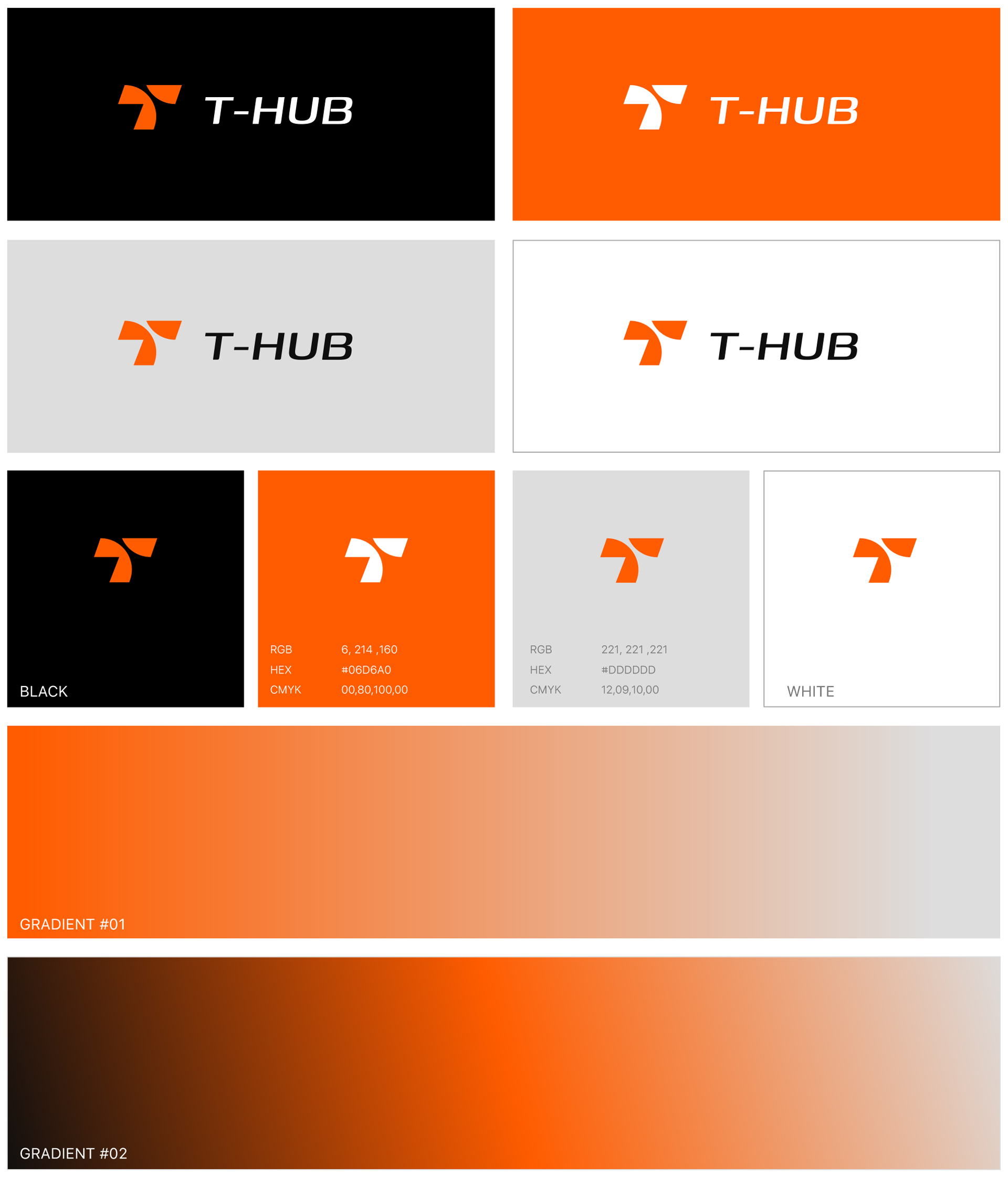
The logo for T-HUB is a powerful visual representation of the company’s identity, values, and ambitions. Designed with simplicity and purpose, it incorporates the letter “T,” serving as a direct and bold reference to the company’s name. This subtle yet effective integration ensures immediate brand recognition while maintaining a professional and contemporary aesthetic. The curved elements within the logo symbolize the company’s global reach and interconnected operations, emphasizing its role in international trade and cross-border activities. These dynamic arcs evoke a sense of movement and adaptability, qualities essential for a business that thrives in diverse sectors such as manufacturing, telecommunications, oil & gas, and government partnerships.
The minimalist design approach ensures versatility, making the logo adaptable across a variety of mediums, from digital interfaces to printed materials and product branding. Its simplicity is intentional, offering a timeless appeal while holding a deeper, multi-layered meaning that reflects the company’s mission and vision. The flowing curves not only represent the interconnectedness of the global market but also highlight the fluidity and innovation that T-HUB brings to its operations.
COLOR PALETTE
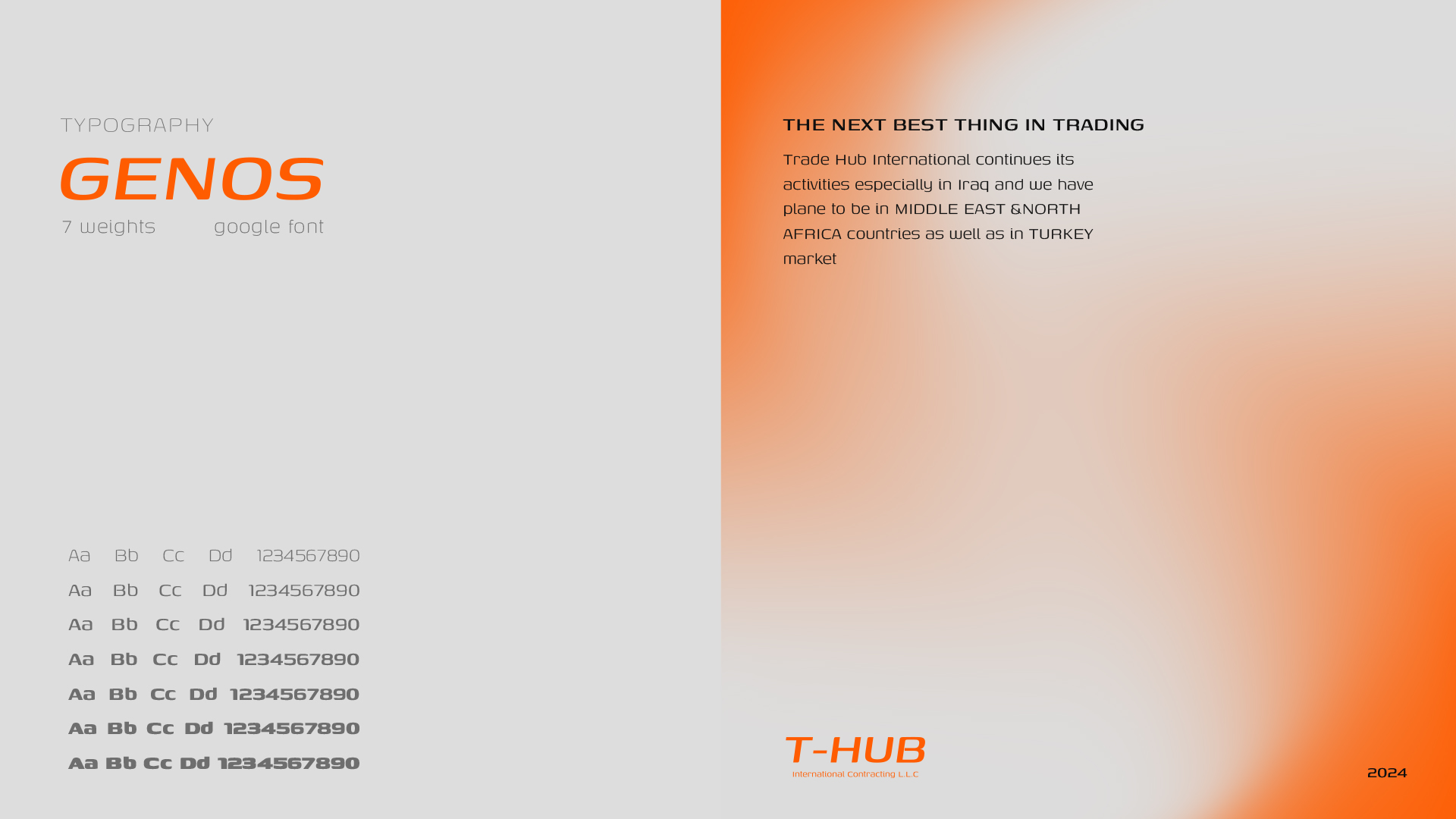
TYPOGRAPHY
