AZIMUTH Visual identity
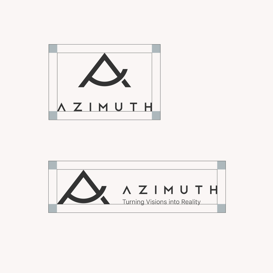
The Azimuth logo is a visual representation of direction, purpose, and the art of creating spaces that feel like home. Its design is rooted in three interconnected concepts: the letter “A,” symbolizing the brand’s name; the Azimuth angle, a universal symbol of precision and guidance; and the house shape, evoking feelings of comfort, safety, and belonging.
CONCEPT
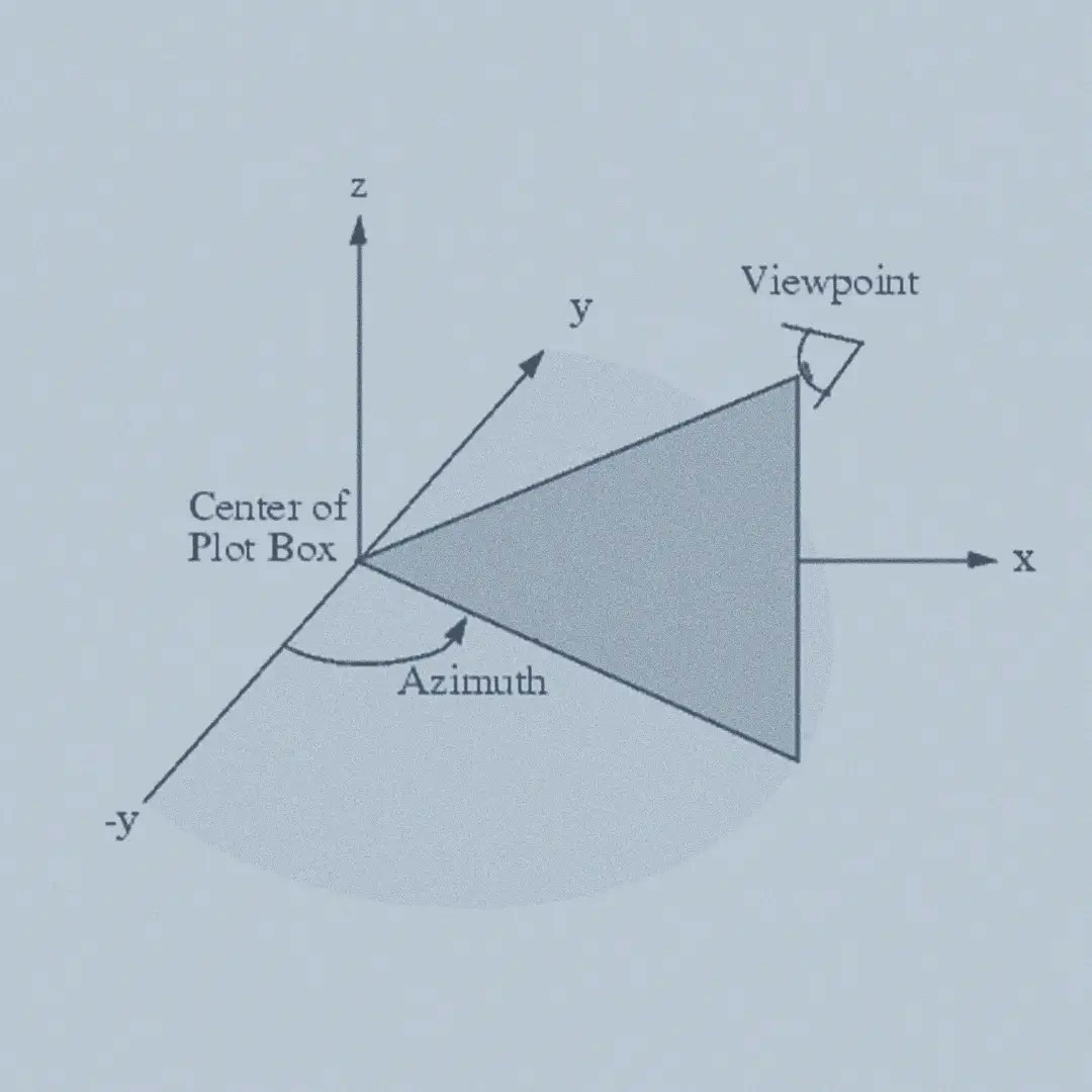
Azimuth
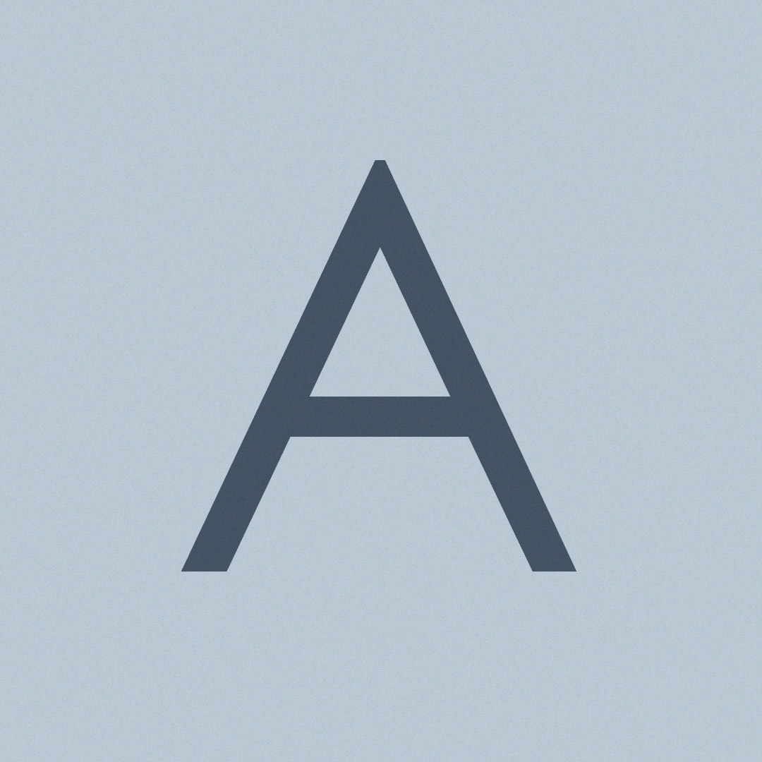
“A” Letter

House Symbol
The bold geometric lines form a seamless connection between these ideas, creating a design that is both modern and meaningful. The sharp, angular structure reflects professionalism and clarity, while the gentle curve within the design represents creativity and adaptability. Together, these elements communicate Azimuth’s ability to balance functionality with aesthetic beauty, a vital quality in interior design.
This logo is more than a symbol—it’s a story. It speaks of a brand that understands the importance of navigating through vision and transforming it into reality. The fusion of abstract geometry with symbolic meaning invites the viewer to see beyond the surface, to feel the care and intention embedded in every detail. It’s a design that doesn’t just represent a company; it embodies a philosophy of precision, harmony, and inspiration.
Azimuth’s logo serves as a guiding star, echoing the brand’s commitment to leading clients through a creative journey that turns their dreams into spaces that truly reflect their essence.

COLOR PALETTE

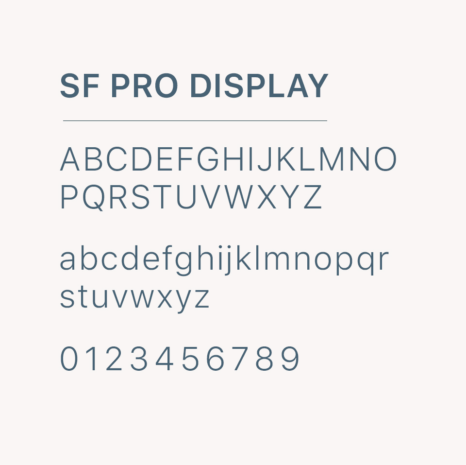
CLEAR SPACE & FONT
