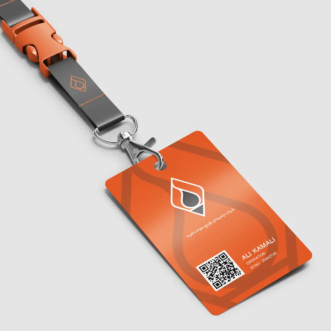
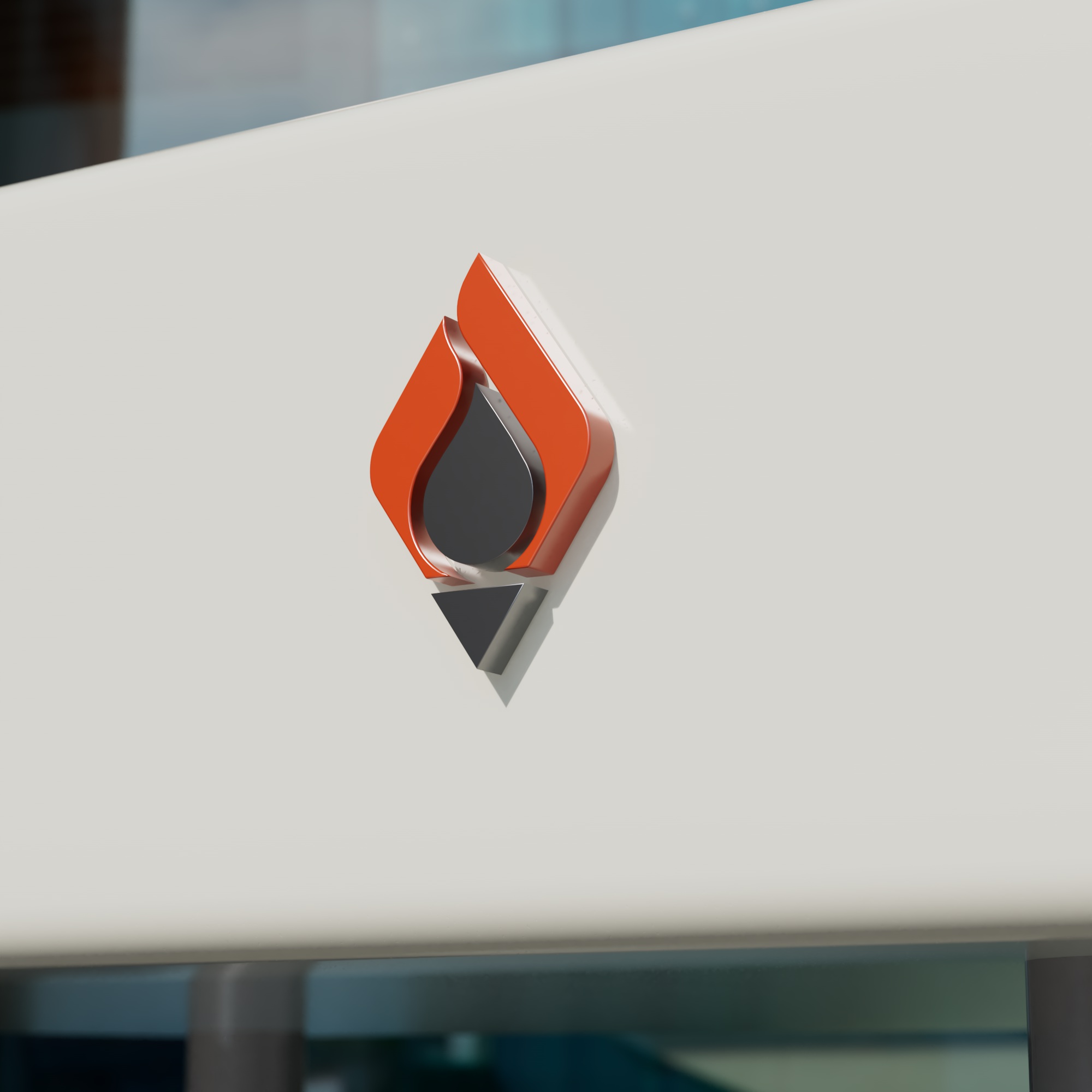
Visual Identity of Farid Chain Fuel Distribution Company
Farid is a knowledge-based company in the field of fuel distribution, recognized for its innovative approach and specialized team. With a strategic vision, the company has expanded its services to national and international oil and gas markets, providing solutions in design, consulting, and engineering. Since 2018 (1397 in the Iranian calendar), Farid has officially obtained the license to operate as a nationwide fuel distribution brand, supplying gasoline, diesel, and CNG.
Concept
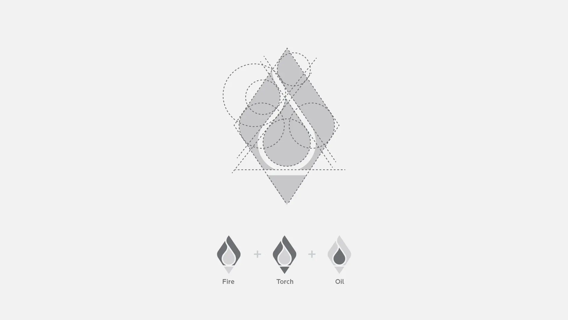
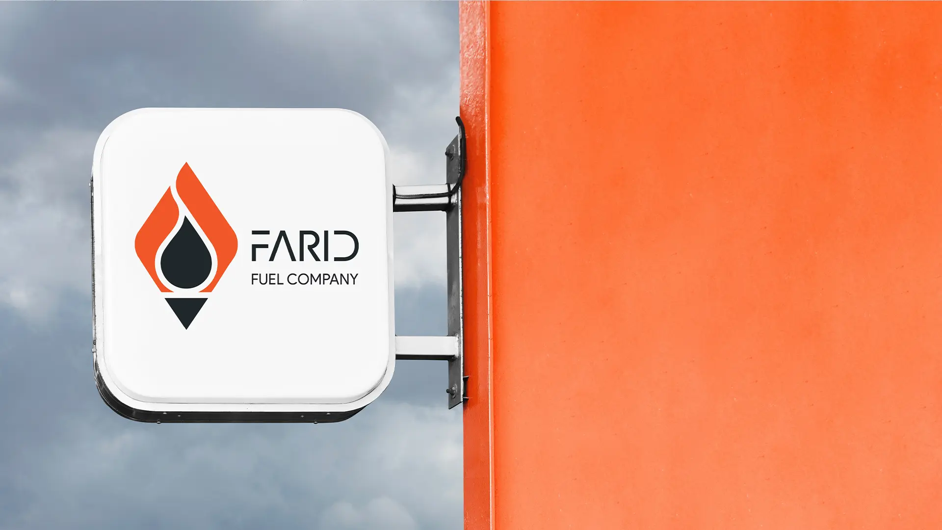
This logo is composed of three key elements — torch, oil, and fire — to visually represent the company’s identity in the energy sector. The flame shape symbolizes progress and leadership, while the central drop signifies oil as the core of the business. The sharp base of the logo conveys precision and direction.
Using bold colors and a simple, structured form, this design communicates concepts such as energy, innovation, and industrial strength in a modern and lasting way.
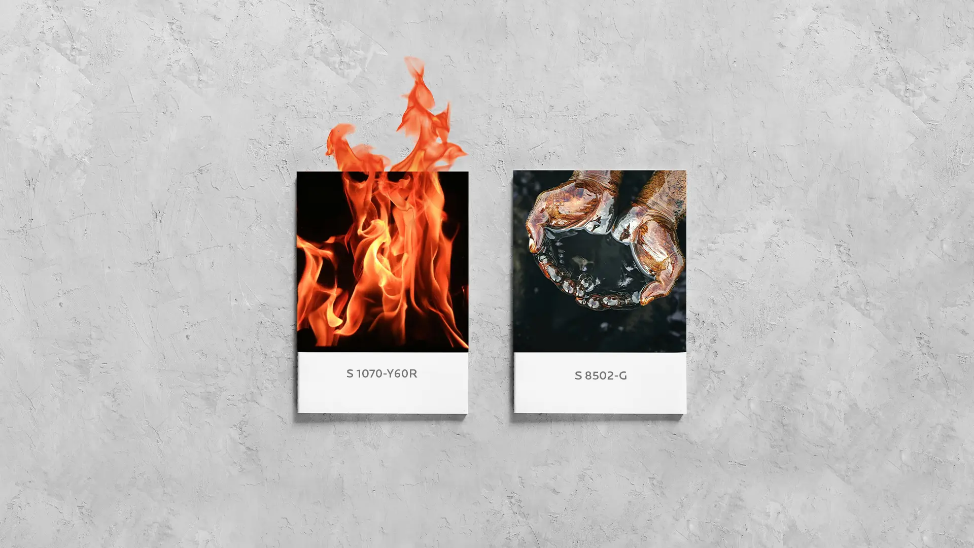
Color palette
