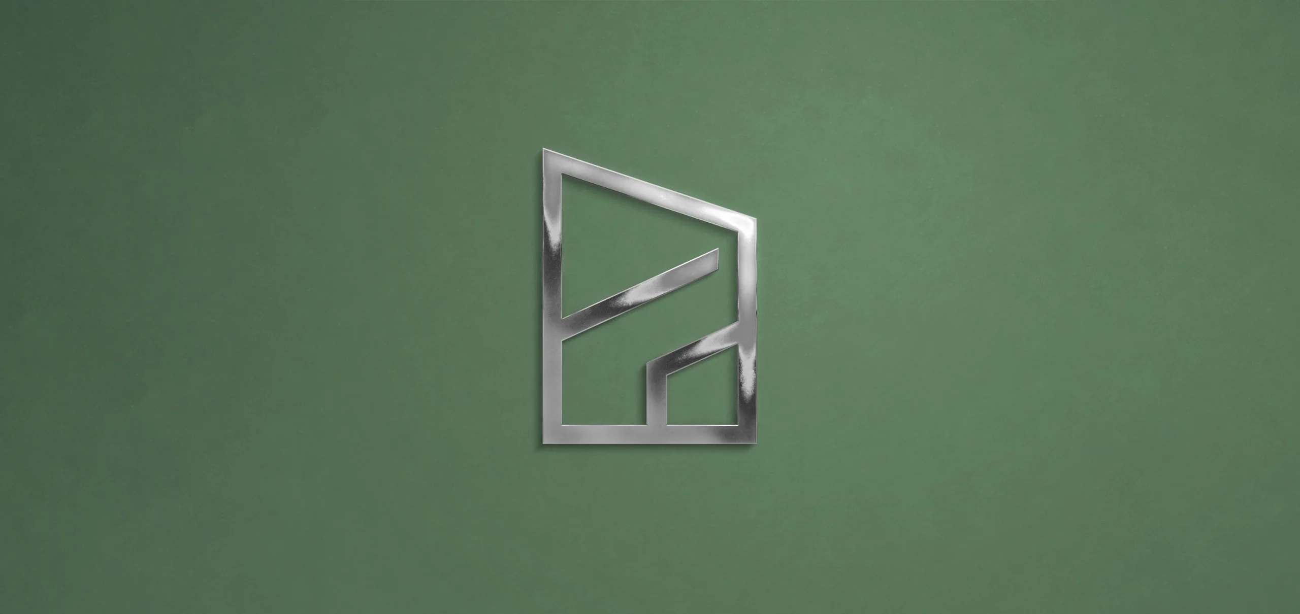
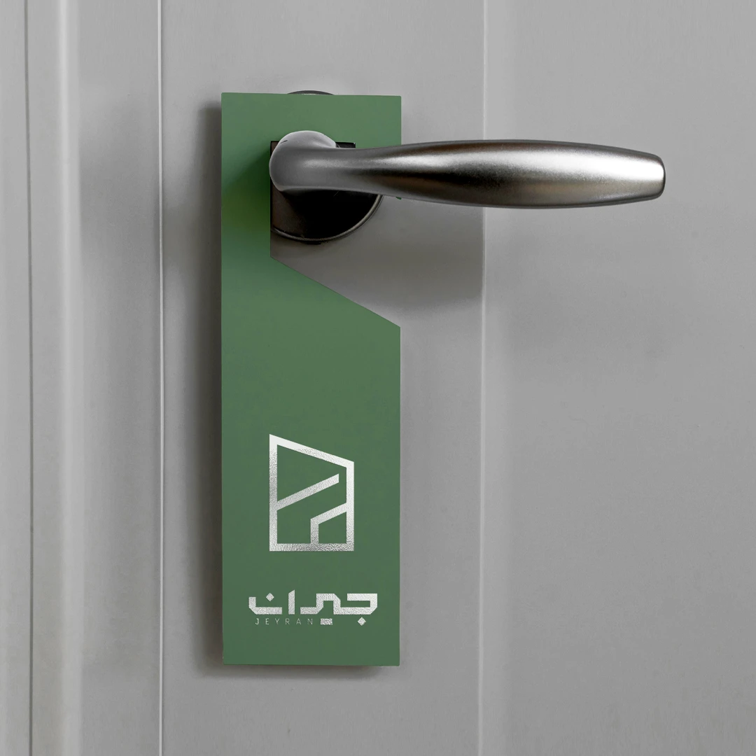
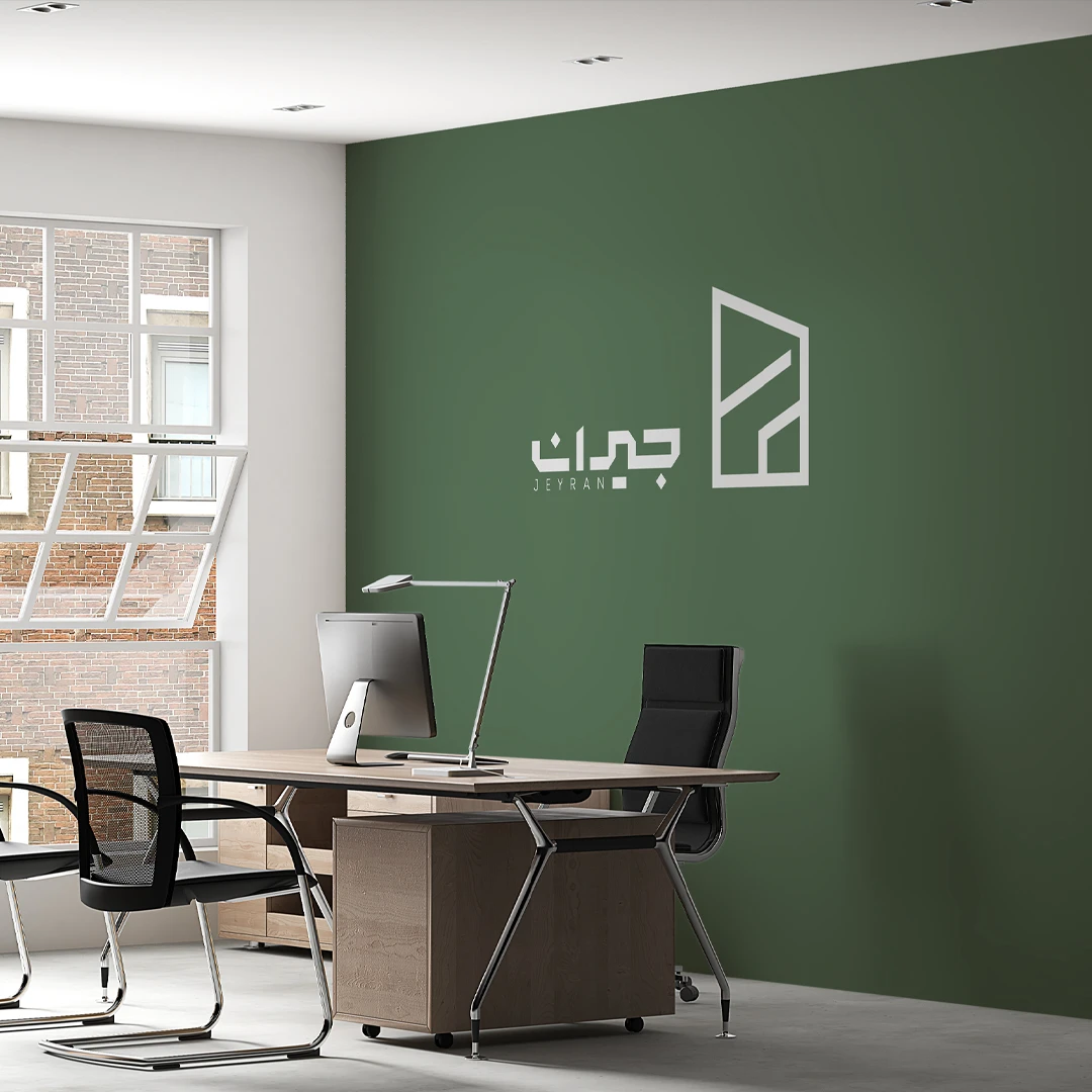
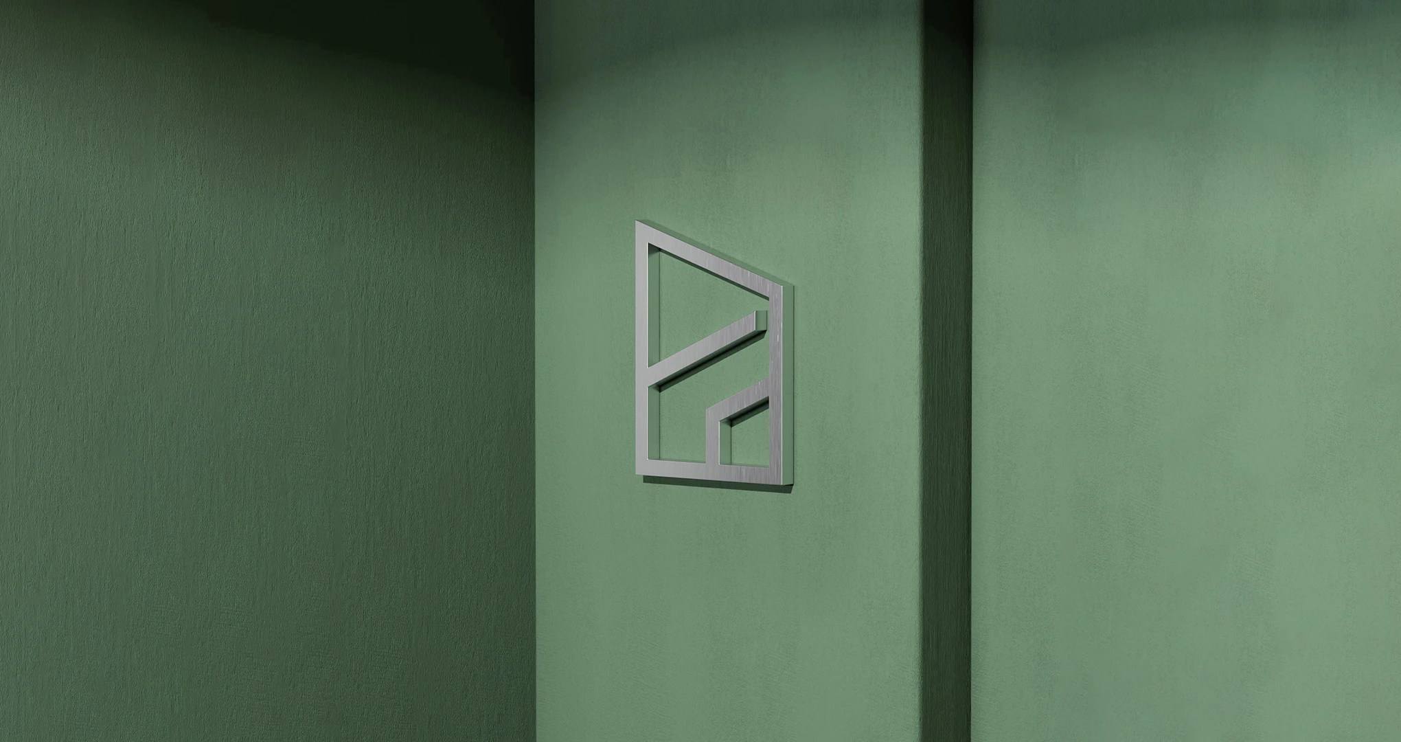
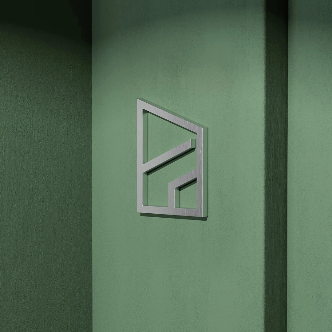
In designing this logo, our goal was to integrate the letter “J” with the symbol of an architectural structure — maintaining simplicity and a minimal form while effectively conveying the strength and stability of a construction brand. The geometric lines and orderly structure of the logo reflect precision, discipline, and solidity in construction projects.
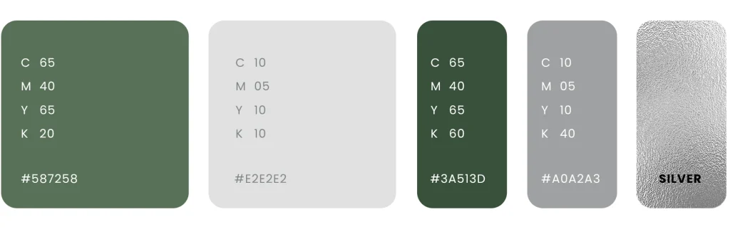
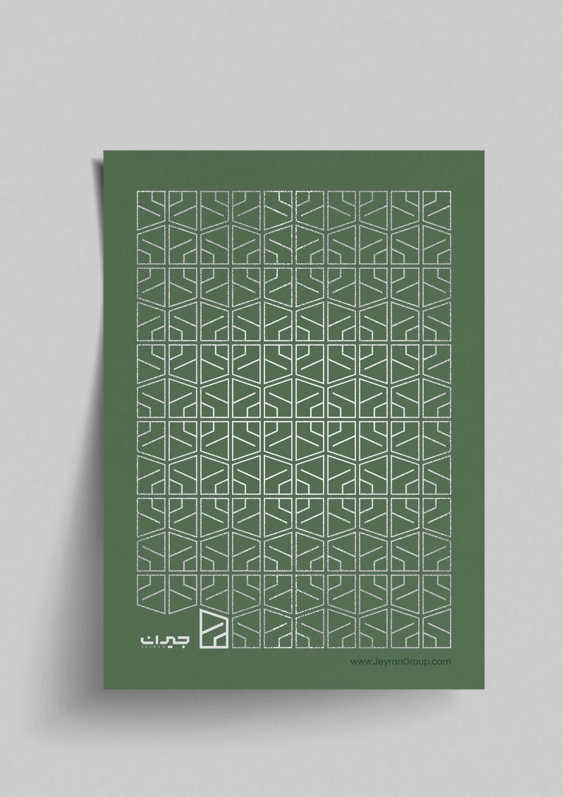
The combination of white and green was a deliberate choice to evoke a sense of luxury, trust, and freshness — a modern pairing that communicates high quality and professionalism to the audience.