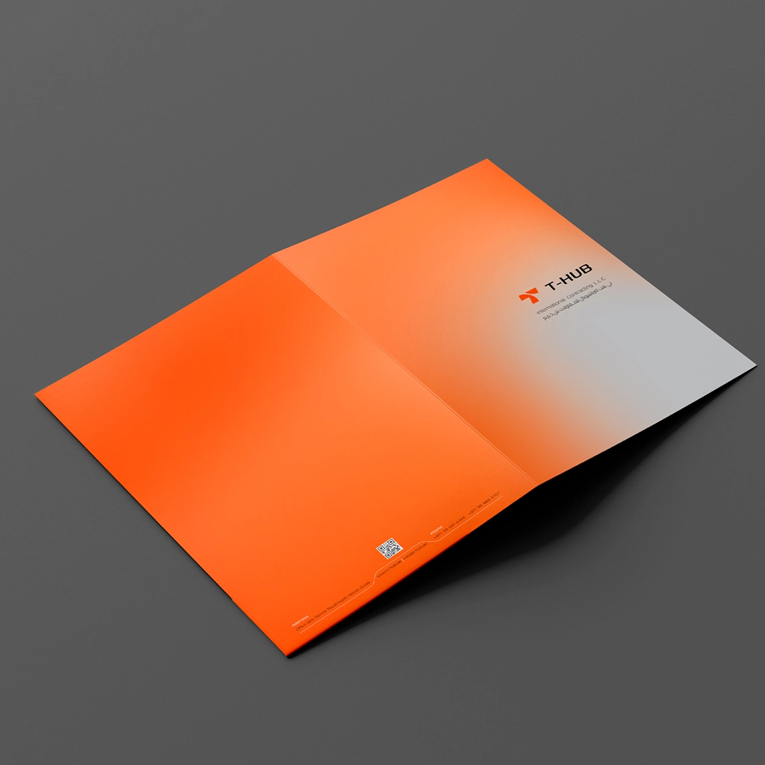
T-HUB Visual Identity
With over 10 years of experience, T-HUB is a professional service company based in Dubai, specializing in the improvement and maintenance of residential and commercial spaces.
Relying on years of expertise and a skilled team, T-HUB offers comprehensive services in HVAC, electrical systems, false ceiling installation, construction, and facilities maintenance.
Adhering to the highest industry standards, precision in execution, prompt response, and customer satisfaction are among T-HUB’s top priorities.
The company’s vision is to deliver integrated, cost-effective, and innovative solutions to enhance the comfort, safety, and value of living and working spaces.
Concept

Old Logo

Symbol of HUB

Letter “T”
The T-HUB logo is a reflection of the company’s identity, values, and vision. Designed with simplicity yet intention, the logo incorporates the letter “T”, making a clear and prominent reference to the company name. This powerful yet subtle composition ensures the brand is instantly recognizable while maintaining its professional and modern appearance.
The curved elements in the logo symbolize the company’s global reach and interconnected activities, highlighting T-HUB’s role in international trade and cross-border operations. These dynamic lines also convey a sense of movement and adaptability.
The minimalist approach to the design makes the logo versatile, performing well across various media — from digital screens to print and product packaging. Its deliberate simplicity, combined with lasting visual appeal, encapsulates deep, multi-layered meanings that reflect the company’s mission and vision.
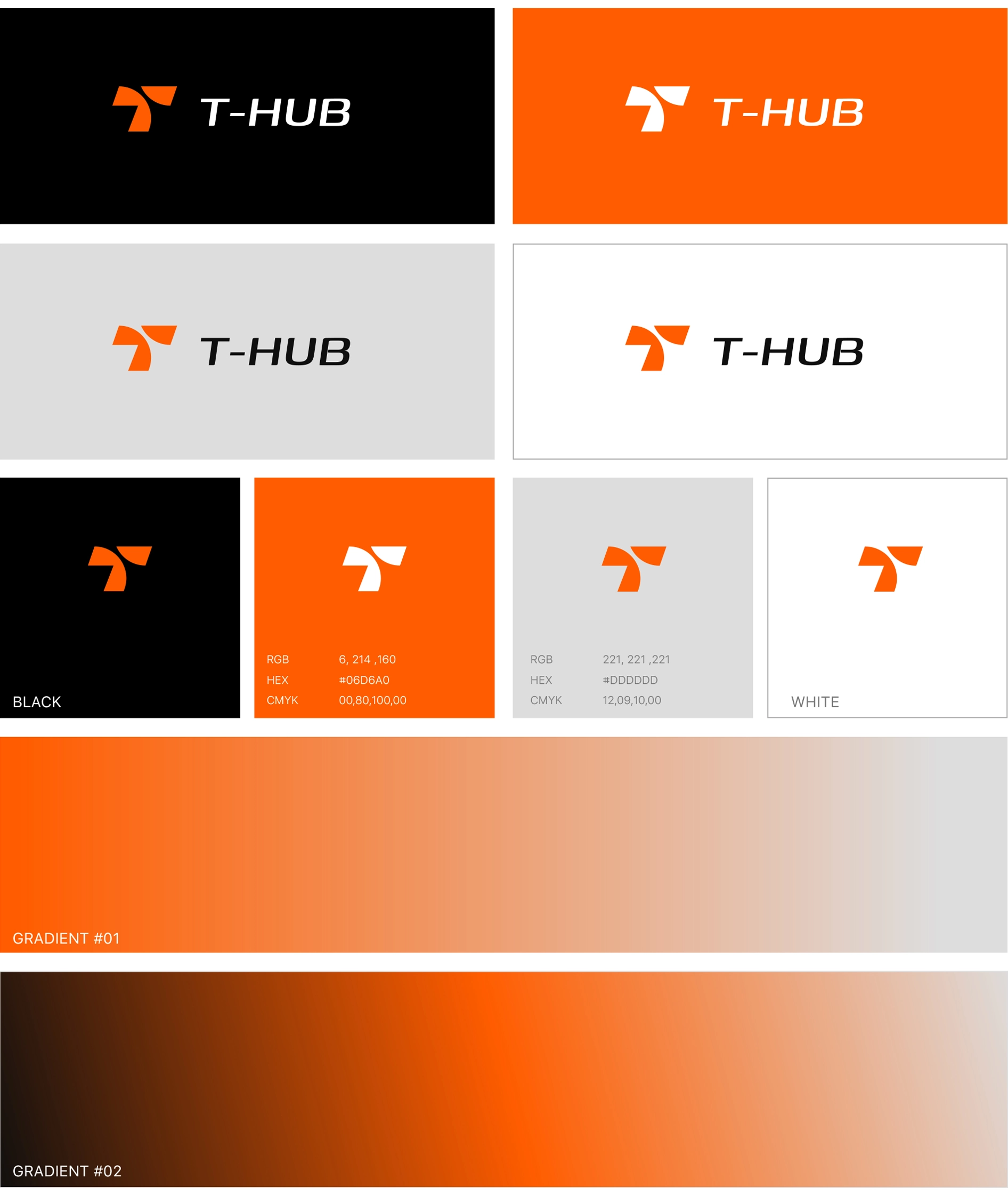
Color palette
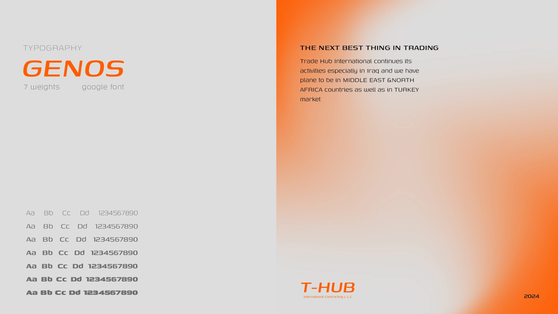
Font
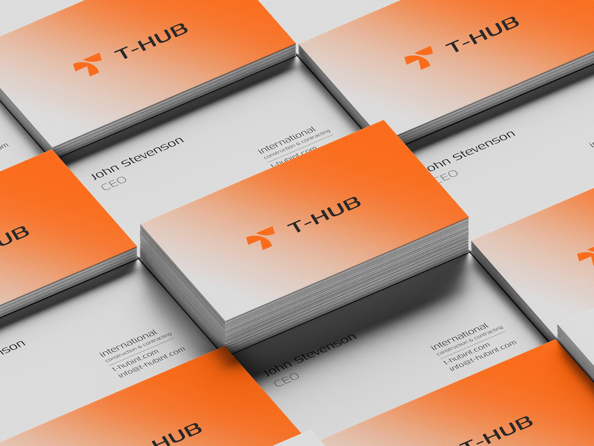

Stationery Design
